1. Roassal Tutorial
Roassal is a visualization engine largely used within the Pharo community. Roassal is used to visualize any set of data. In particular, it is often used to visualize large software source code base to assess their internal quality.
What is the goal of the tutorial?
The following tutorial has been designed to introduce users to the Roassal visualization engine. At the end of the tutorial, users will be familiar to the basic API of Roassal as well with the domain-specific builders. Users will know how to visualize objects within a domain to enable exploration and analysis. They will visualize properties and relationships using the features offered by the engine such as shapes, layout, color, size, interactions (to name a few). Users should also be able to know where to find answers to further questions and to get deeper knowledge in the engine. Let's start.
1.1. Installation
Roassal is easy to install and the installation will not polute your file system. Simply download Moose as indicated on http://moosetechnology.org. You need three downloads: Moose 6.1 image, Pharo60.sources, and a virtual machine. The virtual machine depends on your operating system.
On Max OSX, you can open Moose (which contains Roassal) by drag and dropping the file moose-6.1.image on top of the virtual machine. You should obtain something like in Figure .
1.2. Hand's on: Basic Roassal API
In the following section we are going to incrementally use the basics of the Roassal API. In each step we (1) define a goal, (2) list required actions to achieve the goal, (3) show the changes to be made to the source code of the previous step (second step on), and (4) how the code of the visualization should look like after the changes (that you can copy/paste).
1.2.1. View, Shape, Layout and Interaction
Visualize the Collection class hierarchy using a grid layout
- Create an RTView object
- Create elements using an
RTBoxshape to represent each class - Add the elements to the view
- Lay the elements out using an
RTGridLayout
classes := Collection withAllSubclasses.
view := RTView new.
els := RTEllipse new
	elementsOn: classes.
view addAll: els.
RTGridLayout on: els.
els @ RTPopup.
els @ RTDraggable.
view @ RTDraggableView.
view
1.2.2. Size, Color and Customize Popup
Map to the size and color of each box metrics of classes
- When creating the elements send the messages
color:,size: - Customize the
text:of the popup
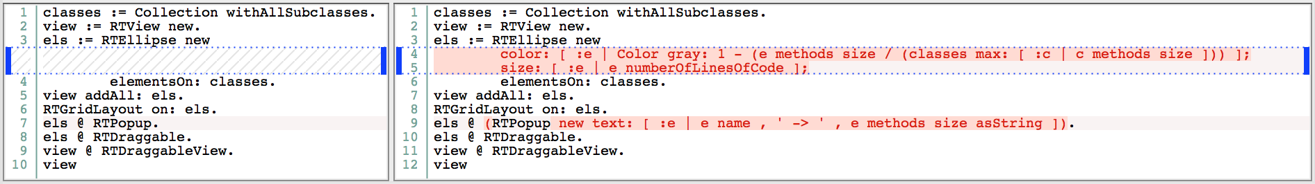
classes := Collection withAllSubclasses.
view := RTView new.
els := RTEllipse new
	color: [ :e | Color gray: 1 - (e methods size / (classes max: [ :c | c methods size ])) ];
	size: [ :e | e numberOfLinesOfCode ];
	elementsOn: classes.
view addAll: els.
RTGridLayout on: els.
els @ (RTPopup new text: [ :e | e name , ' -> ' , e methods size asString ]).
els @ RTDraggable.
view @ RTDraggableView.
view
1.2.3. Edges
Show the class hierarchy using edges and a tree layout.
- Add edges from the superclass to the subclass
- Change the layout to a
RTTreeLayout
classes := Collection withAllSubclasses.
view := RTView new.
els := RTEllipse new
color: [ :e | Color gray: 1 - (e methods size / (classes max: [ :c | c methods size ])) ];
size: [ :e | e numberOfLinesOfCode ];
elementsOn: classes.
view addAll: els.
ei := RTEdgeBuilder new.
ei view: view.
ei objects: classes.
ei shape line color: Color gray.
ei connectFrom: #superclass to: #yourself.
RTTreeLayout on: els.
els @ (RTPopup new text: [ :e | e name , ' -> ' , e methods size asString ]).
els @ RTDraggable.
view @ RTDraggableView.
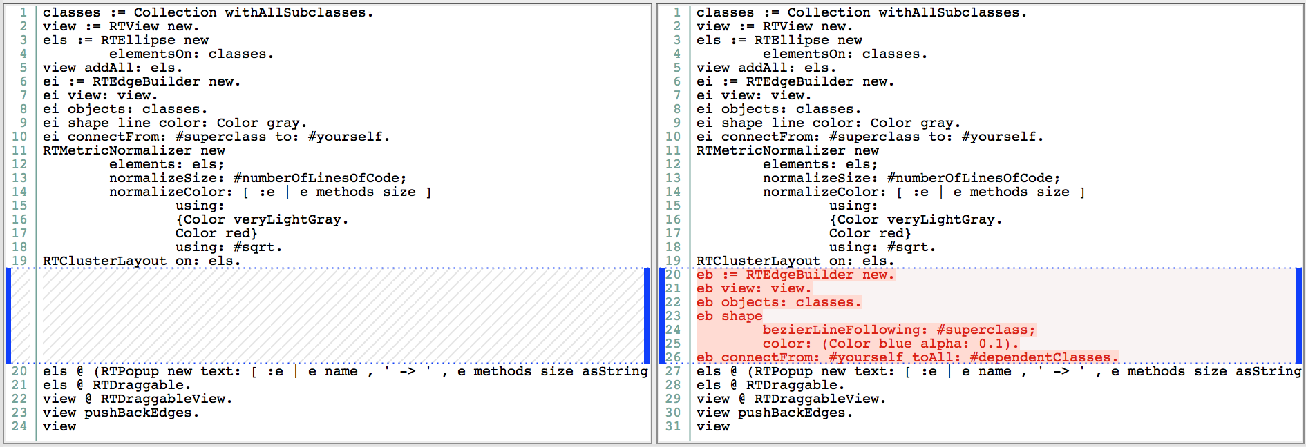
view1.2.4. Normalization
Adjust the visualization using normalization to map color and size, and apply a more scalable layout.
- Remove messages
color:andsize:sent during the creation of elements - Add an
RTMetricNormalizerobject to map the color and size - Change the shape of elements to use
RTEllipse - Push edges to the back of the circles

classes := Collection withAllSubclasses.
view := RTView new.
els := RTEllipse new
	elementsOn: classes.
view addAll: els.
ei := RTEdgeBuilder new.
ei view: view.
ei objects: classes.
ei shape line color: Color gray.
ei connectFrom: #superclass to: #yourself.
RTMetricNormalizer new
	elements: els;
	normalizeSize: #numberOfLinesOfCode;
	normalizeColor: [ :e | e methods size ]
		using:
		{Color veryLightGray.
		Color red}
		using: #sqrt.
RTClusterLayout on: els.
els @ (RTPopup new text: [ :e | e name , ' -> ' , e methods size asString ]).
els @ RTDraggable.
view @ RTDraggableView.
view pushBackEdges.
view
1.2.5. Bezier Edges
Add a different kind of edges to depict class dependencies
- Add bezier edges from each class to dependent classes
classes := Collection withAllSubclasses.
view := RTView new.
els := RTEllipse new
	elementsOn: classes.
view addAll: els.
ei := RTEdgeBuilder new.
ei view: view.
ei objects: classes.
ei shape line color: Color gray.
ei connectFrom: #superclass to: #yourself.
RTMetricNormalizer new
	elements: els;
	normalizeSize: #numberOfLinesOfCode;
	normalizeColor: [ :e | e methods size ]
		using:
		{Color veryLightGray.
		Color red}
		using: #sqrt.
RTClusterLayout on: els.
eb := RTEdgeBuilder new.
eb view: view.
eb objects: classes.
eb shape
	bezierLineFollowing: #superclass;
	color: (Color blue alpha: 0.1).
eb connectFrom: #yourself toAll: #dependentClasses.
els @ (RTPopup new text: [ :e | e name , ' -> ' , e methods size asString ]).
els @ RTDraggable.
view @ RTDraggableView.
view pushBackEdges.
view
1.3. Does it scale to larger software?
Let's see. Now we are going to load a model of Tomcat into the Moose image and ajdust the visualization to analyze it. The model contains a description of the main properties of the software such as classes, methods and invocations. Also, we are going to link the model to the software's source code, so we can inspect it within the visualization.
1.3.1. Set-up
- Download Tomcat's model and sources
- In Moose open from the menu the Moose panel and load the MSE model file
- Once the model is loaded, decompress the zip file that contains the sources. In the panel right-click the model and select utilities>Set root folder, then specify the local folder that contains Tomcat's sources.
1.3.2. Visualizing Tomcat's class hierarchy and dependencies
Show how the visualization performs on larger software (~1 min.).
- Adapt the data source to point to the classes within the Tomcat's model
- Modify the calls accordingly to obtain the dependent classes (other calls use similar signatures)

classes := MooseModel root first allClasses.
view := RTView new.
els := RTEllipse new
	elementsOn: classes.
view addAll: els.
ei := RTEdgeBuilder new.
ei view: view.
ei objects: classes.
ei shape line color: Color gray.
ei connectFrom: #superclass to: #yourself.
RTMetricNormalizer new
	elements: els;
	normalizeSize: #numberOfLinesOfCode;
	normalizeColor: [ :e | e methods size ]
		using:
		{Color veryLightGray.
		Color red}
		using: #sqrt.
RTClusterLayout on: els.
eb := RTEdgeBuilder new.
eb view: view.
eb objects: classes.
eb shape
	bezierLineFollowing: #superclass;
	color: (Color blue alpha: 0.1).
eb connectFrom: #yourself toAll: [ :e | e methods flatCollect: #clientTypes ].
els @ (RTPopup new text: [ :e | e name , ' -> ' , e methods size asString ]).
els @ RTDraggable.
view @ RTDraggableView.
view pushBackEdges.
view
1.3.3. Adapting the visualization for larger software
Distinguish Tomcat classes from libraries (Java core and external libs) and change the layout to ease the analysis of dependencies (~2.5 mins.)
- When creating elements use the message
color:to distinguish the source of a class (whether or not it belongs to Tomcat) and remove the previous definition from the normalizer - Change the layout to
RTForceBasedLayout
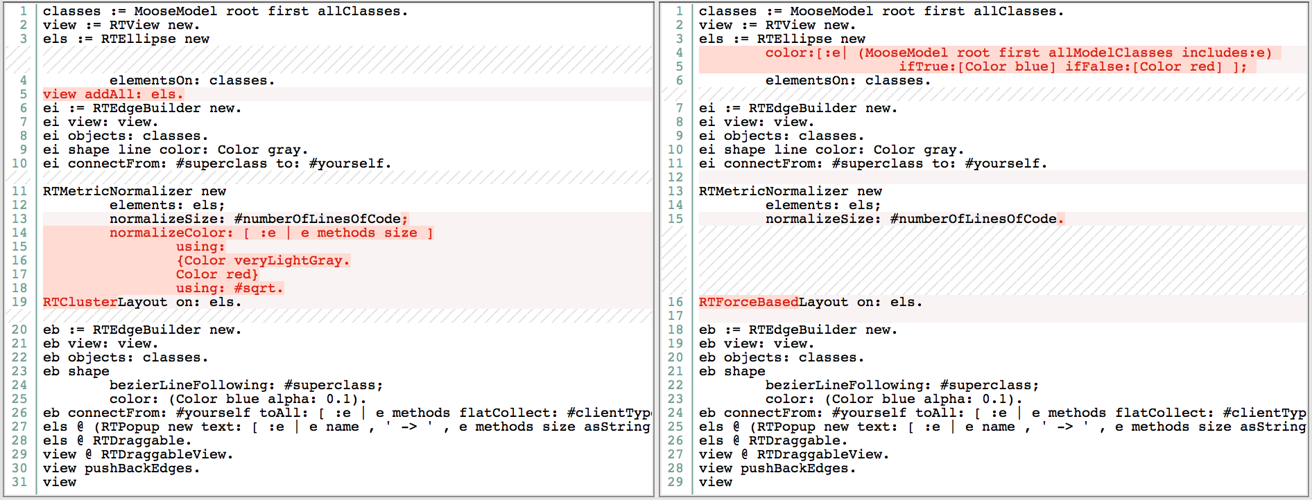
classes := MooseModel root first allClasses.
view := RTView new.
els := RTEllipse new
	color:[:e| (MooseModel root first allModelClasses includes:e)
			ifTrue:[Color blue] ifFalse:[Color red] ];
	elementsOn: classes.
view addAll: els.
ei := RTEdgeBuilder new.
ei view: view.
ei objects: classes.
ei shape line color: Color gray.
ei connectFrom: #superclass to: #yourself.

RTMetricNormalizer new
	elements: els;
	normalizeSize: #numberOfLinesOfCode.
RTForceBasedLayout on: els.

eb := RTEdgeBuilder new.
eb view: view.
eb objects: classes.
eb shape
	bezierLineFollowing: #superclass;
	color: (Color blue alpha: 0.1).
eb connectFrom: #yourself toAll: [ :e | e methods flatCollect: #clientTypes ].
els @ (RTPopup new text: [ :e | e name , ' -> ' , e methods size asString ]).
els @ RTDraggable.
view @ RTDraggableView.
view pushBackEdges.
view
2. Exercise
2.1. Using Roassal API build a visualization to analyze Tomcat's class hierarchy.
2.1.1. Build a visualizatiom that uses a Treemap to depict class hierarchy and that maps to the area of the tiles the number of lines of code of the class they represent. Use two different colors to identify the classes that contain deprecated methods and the ones that might be tests. Hint: (1) you can assume that the name of test classes contain the Test word. (2) Include in the visualization stubs of the Java core and libs classes (.e.g., Object). (3) Notice that the model of the methods of a class contain its annotations.
Solution
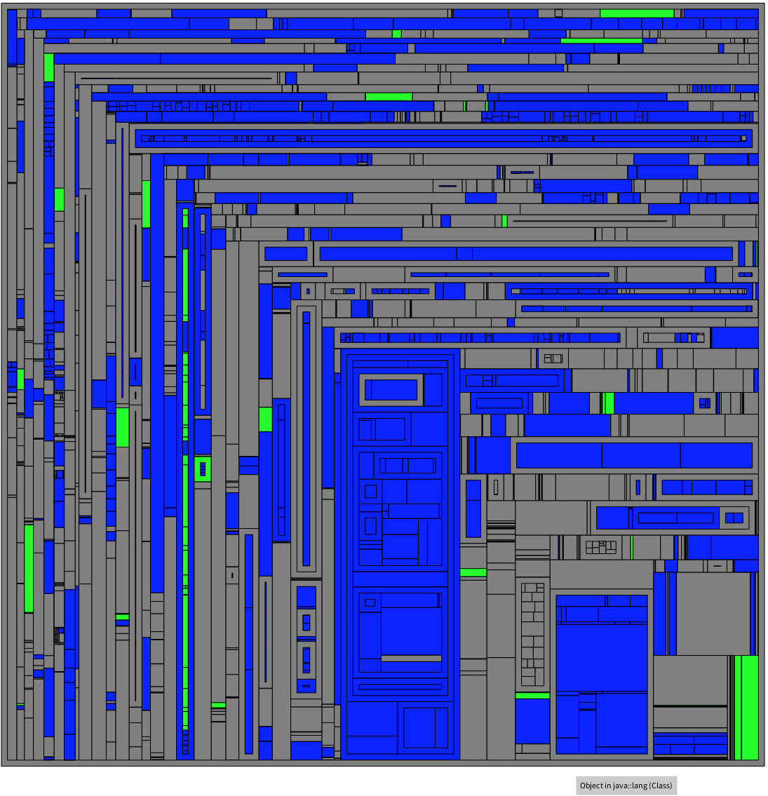
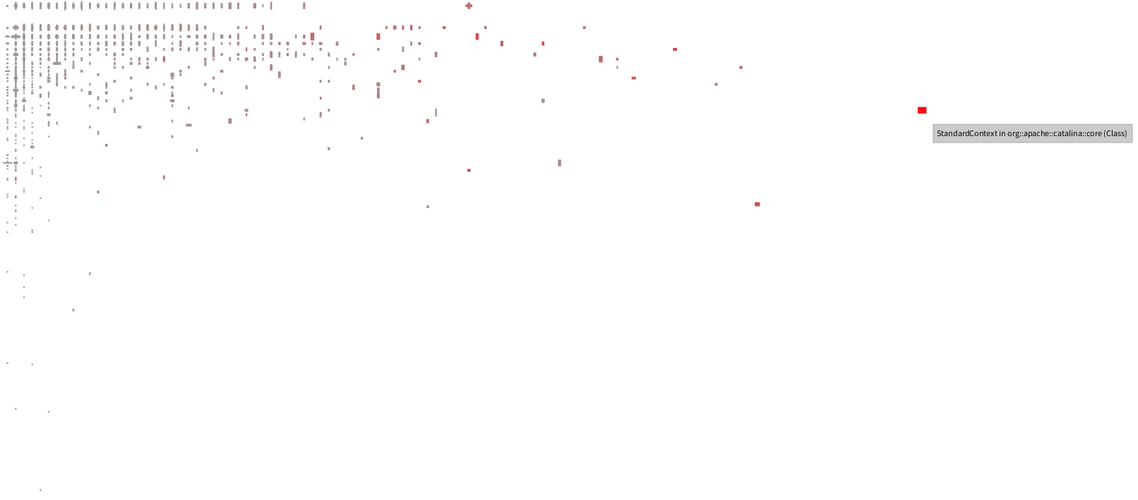
2.2. Polymetric Views provides insights of the various aspects of a software by mapping multiple metrics to the attributes of rectangles that represent software entities (e.g., classes). In this exercise you have to create a visualization that maps Tomcat classes to rectangles. Each rectangle has to encode: (1) the #hierarchyNestingLevel in its height, (2) the #numberOfAttributes to its width, (3) #fanOut in its color; and the x-position of rectangles must encode #fanOut and y-position =#fanIn. The resulting visualization should look like the one below. Analysis of the visualization and highlight insights that you found. Hint: How fanOut relates to other metrics?
Solution
3. Resources
Links to resources for more detail on the Pharo language, the Moose plataform and the Roassal visualization engine.
- Pharo
- Moose technology
- Deep into Pharo book
- Agile Visualization book
- Roassal examples shipped in the Pharo/Moose image.
- Pharo users mailing lists