CollaborationExplorer
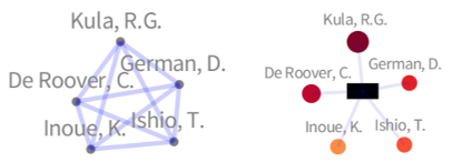
Collaboration networks express how collaborators participate in common projects. Groups of collaborators may work together on a number of different projects, within a particular community. Understanding which groups have been active in the past, which are currently active in a community, and which are relevant for one's own work can be challenging. Although graph- based visualization of collaboration networks can provide insights into groups, the evolution of activity, and impact in the community, they suffer from edge cluttering. We address this issue by modelling collaboration networks as a bigraph that reduces overlapping edges, and provides users with an identifiable representation of projects. The following figure compares a small network modelled as a graph (left) and a bigraph (right).
 |
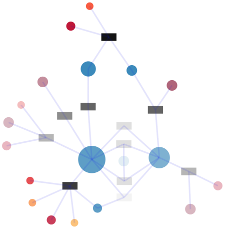
We take the specific case of authors collaborating on papers, and show how dedicated visualizations of collaboration networks that encode attributes such as impact can be used to effectively identify the key groups over time. In a paper the order of authors means very different things in different communities. Sometimes it is strictly alphabetical, sometimes in order of contribution, and sometimes the final position is reserved for supervisors. In out visualization we model collaboration networks as a bigraph that contains two sets of nodes, one representing papers and the other representing authors. In the visualization blue circles represent authors that belong to the community (have published several papers), while a gradient of color from yellow to red is used for new authors who have collaborated in only one paper. The size of author nodes encodes the impact of an author in the community. The following figure depict the basic mapping.
 |
Comparing a visualization that defines the impact of authors as the sum of her publications (see Figure 1) to a visualization that defines the impact of authors as considering the position of the author (see Figure 2) we realize authors in the last positions published many more papers than authors in the first ones. A possible explanation to this is that the last position is reserved to supervisors.
In the future we plan to design new visualization techniques to increase the properties that can be mapped, experiment with parameters of the layout to increase the readability of the visualization, and investigate visualizations better suited to compare collaboration among different communities.