Visualizing Collaboration Networks
Motivation
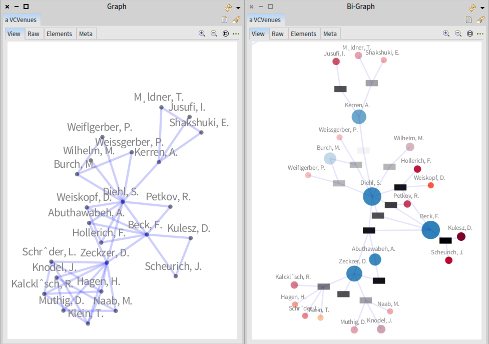
Open-source software is normally build by large groups of developers that remotely commit changes to a repository. Different developers can modify parts of the same component. Therefore, code authorship is the result of collaboration among developers. However, the degree of contribution of developers vary throughout components and over time. In a visualization, entities and relationships have a concrete representation, making complex data easier to understand. The most frequent visualization of collaboration networks is a graph (left figure). In it, nodes represent authors, and the edges link authors that collaborated in the same piece of code. However, due the high number of edges the resulting visualization is difficult to understand. Alternatively, to avoid this problem, collaboration networks can be visualized as bi-graphs (right figure). In a bi-graph, components are also represented by nodes.
 |
Approach
In this project we will work reviewing suitable visualization techniques for collaboration networks that provide a more comprehensive understanding. We will develop prototypes using Pharo (a Smalltalk inspired language) and Roassal (a visualization engine).
Research Questions
- What kind of visualization techniques are appropriate for collaboration networks?
- How can we adapt these techniques for comparing networks and to encode other properties (e.g. size, and structure of components, and time)?
Further reading
- Pharo: http://www.pharobyexample.org
- Roassal: http://agilevisualization.com
Contact Leonel Merino, Yuriy Tymchuk